Last Updated on 30 January 2024 by automiamo.com
I have developed just an algorithm that retrieves data from TradingView and sends the result to my Telegram channel.
The model shown in the image below was used as a reference for all calculations.
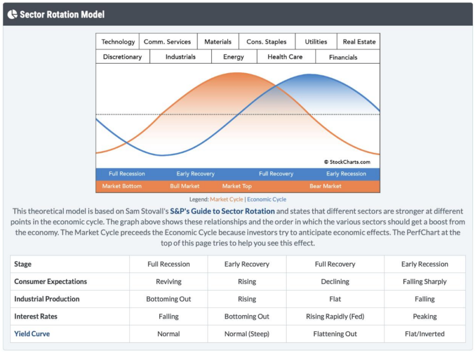
What does this model mean?
Each sector is stronger at a specific point in the economic cycle.
What have I added to the model?
Each sector that is stronger at a specific point in the economic cycle should be stronger than the sectors that were stronger in the previous economic cycle.
The sequence of economic cycles is: full recession, early recovery, full recovery, early recession.
I have also included commodities, bonds and currencies in this model.
The algorithm
Example from the industrial sector
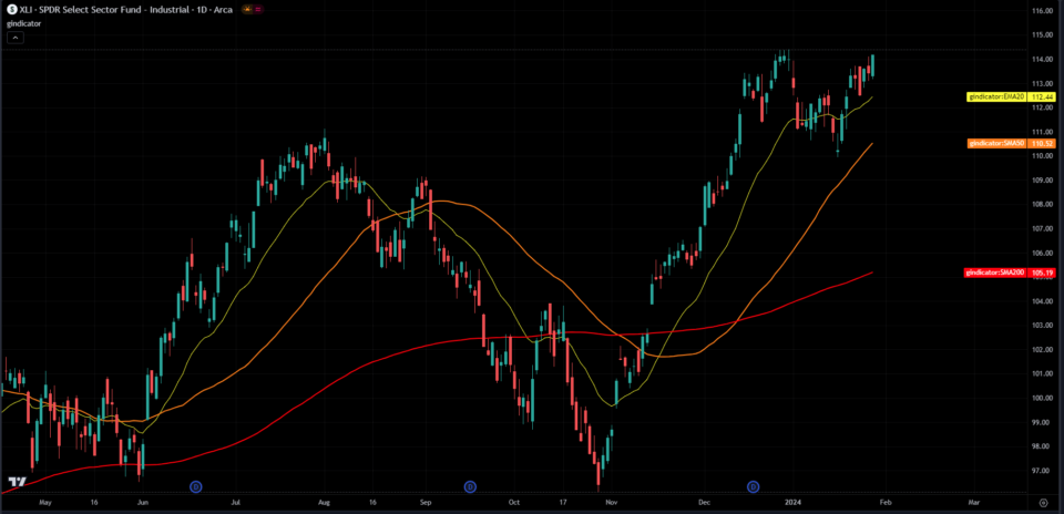
The industrial sector (XLI) is strong at the early recovery cycle, while the technology sector (XLK) is strong at the previous economic cycle, the full recession.
Then, the industrial sector should be stronger than the technology sector.
I use the XLI/XLK chart from TradingView to calculate the relative strength
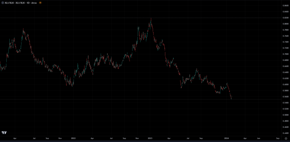
A bullish industrial sector along with its bullish strength to the technology sector are two solid confirmations that the early recovery is more likely to be discounted by investors.
Trends are calculated using 200-periods and 50-periods simple moving averages (SMA). Neutral trend is uncertainty and not a confirmation of the economic cycle.
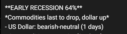
Example of a full recession in percent overall
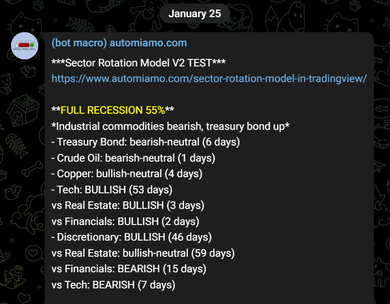
- Treasury Bond EXPECTED bullish ACTUAL bearish-neutral (not a confirmation)
- Crude Oil EXPECTED bearish or bearish-neutral ACTUAL bearish-neutral (confirmation)
- Copper EXPECTED bearish or bearish-neutral ACTUAL bullish-neutral (not a confirmation)
- Tech EXPECTED bullish or bullish-neutral ACTUAL bullish (confirmation)
- Tech vs Real Estate EXPECTED bullish or bullish-neutral ACTUAL bullish (confirmation)
- Tech vs Financials EXPECTED bullish or bullish-neutral ACTUAL bullish (confirmation)
- Discretionary EXPECTED bullish or bullish-neutral ACTUAL bullish (confirmation)
- Discretionary vs Real Estate EXPECTED bullish or bullish-neutral ACTUAL bullish-neutral (confirmation)
- Discretionary vs Financials EXPECTED bullish or bullish-neutral ACTUAL bearish (not a confirmation)
- Discretionary vs Tech EXPECTED bullish or bullish-neutral ACTUAL bearish (not a confirmation)
- US Dollar Index (jolly) EXPECTED bullish-neutral ACTUAL bearish-neutral (not a confirmation)
Note: US dollar index is expected to be bullish at the early recession cycle, while bullish-neutral at the next full recession cycle.
Formula
Actual percentage = total confirmations / total assets = (6/11)% = 55%
This is the percentage investors and traders are discounting the full-recession cycle in the next future.
What is Mr. Market discounting now?
Let see it and subscribe free to my macro telegram channel!
Giancarlo Pagliaroli
Disclaimer: The information and publications are not meant to be, and do not constitute, financial, investment, trading, or other types of advice or recommendations supplied or endorsed by me.
Hello, you’re right. I am adding more details to this post, including examples and the percentage formula. I would appreciate any further suggestions on this model I have developed. Thank you very much.
Ehi, thanks you for amazing job! However, tbh, i’m not getting what are you checking with your algo in here and how the percentage you are given on telegram, are computed!
Surely my fault, but could you be clearer? 🙂
Adding version 2 on telegram with more trends and bars-since calculation for each trend. Deleting lumber and iron and welcome to treasury bond and us dollar!
adding more checks at single sectors and commodities on my telegram screener
revised the pinescript and screener on telegram